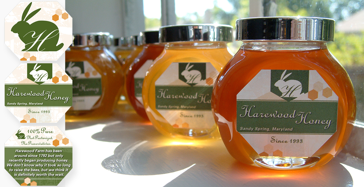
Harewood farm, named for a successful rabbit hunt in the late 1700’s, was in need of an identity and label for their locally produced honey.
Rather than using a standard " honey bee" for the label, XianStudio, LLC decided to brand the farm and use a "Hare" design. A glass jar was chosen to display the product, which color appears in various hues depending on harvest time. A rabbit silouette with a scripted “H” for Harewood was created as an overall brand for the farm.
The label, in the shape of a stylized honeycomb, along with small honeycomb "dots" in shades of amber reflect back to the product. To provide further depth, an enlarged line drawing of the farm was placed faintly in the background.
To give the product a rural feel, We penned the text appearing on the back label: “Harewood Farm has been around since 1792 but only recently began producing honey. We don’t know why it took so long to raise the bees, but we think it is definitely worth the wait.”
The new packaging has been received well at farmer’s markets and sales are up.
